

Foundational Design System for Scalable Product Development
Timeline
4 Weeks
Team
Myself (Design System Lead) Principal Designer
Responsibilities
UX & Visual Audit, Defining Design Tokens, Design System Structure and UI Kit
Tools
Figma
CONTEXT
Rushed MVP Delivery Led to Visual Inconsistencies and Inefficiencies
Design inconsistencies and fragmented components were slowing down the product development lifecycle at HealthX. Designers were recreating similar UI elements from scratch, leading to visual inconsistency, longer timelines, and reduced efficiency. As the platform grew across multiple modules in the healthcare ecosystem, the need for a scalable and unified design system became essential.
Impact: Faster design cycles, visual consistency, and design-to-dev scalability
PROBLEM
Inconsistent UI and Inefficient Workflow Were Blocking Scale
Lack of standardized components led to repeated effort and confusion.
No shared visual language caused inconsistency across modules.
Increased design time due to absence of reusable tokens or libraries.
SOLUTION
A Centralized, Scalable Design System to Align Design and Development
Defined core design foundations to bring harmony in visual language.
Built reusable components with clarity and reuse.
Designed system keeping future integration with Storybook and dev handoff in mind.
PROCESS OVERVIEW
How I Designed a Scalable System from the Ground Up
Audit First: Analyzed existing UI patterns across modules to identify inconsistencies and pain points.
Modular Approach: Structured the system to allow reuse across different products use cases.
Documentation: Created detailed documentation to help designers onboard faster and stay aligned.
RESEARCH
What I Learned from the Existing UI Chaos
Auditing the MVP screens revealed inconsistent color usages, multiple typography styles, and varied spacing schemes. We benchmarked against industry standard design systems (material design and HIG) to align with platform standards and improve visual consistency.

Pain Points
Visual Inconsistency: Multiple styles used for the same components across screens.
Naming Confusion: Designers had different naming conventions causing friction in collaboration.
Efficiency Gaps: Time wasted in recreating ui components such as buttons, inputs, and layout patterns from scratch.
Needs
A standardized token-based system for color, spacing, and type.
Clear naming and organization for quick access and use.
Scalable structure to support upcoming modules and future dev integration.
DESIGN SYSTEM FOUNDATION
Setting the Ground Rules for Visual and Functional Consistency
1. Colors
1.1 Primitive colours
Primitive colors are base-line hues like “Blue, Red and Green” that act as the default color palette for your design system.
HealthX has a 8:

1.2 Color scale
We create a 9 step tint and shade scale for the base colors. Tints are created by increasing the lightness value of the base color, and shades are created by decreasing it.

1.3 Naming
We name our primitive colors using this naming convention:
Color (group) /Value
Which for example gives us:
Brand/100
Blue/200
Teal/300
Red/400
Yellow/500
Orange/600
Green/700
Primary/White
Primary/Black

Created primitive colour variables tokens in Figma which include all the defined tint and shaded, which is in future we will use for semantic tokens
1.4 Semantic colors
Semantic colors have meaning and are named based on how they’re used, not what they look like.
A good way to visualise this is to look at the example below. The hex value has been assigned to the primitive color, which has been assigned to the semantic color, which has been used as the background of the button component.
For Dark Mode, you simply change the primitive variable that is assigned to “Background Brand” from Brand 500 to Brand 400, and if your set of brand primitive variables changes color, it will do so across the entire design system and the products that consume it.

1.5 Semantic colors naming
We use the schema in the table below to name our semantic variables.

Which gives us:
Content/Link/Hover
Background/Primary/Pressed
Border/Subtle
Surface/L3
Overlay/Inverse/50


2 Typography
2.1 Font family
To set up our typography, we start with the font family, which is a group of type faces you use across your system. HealthX uses Manrope as its default type face.

2.2 Weight
Each font family comes in different weights, which is how thick each character is. We use Regular, Medium, Semibold and Bold in HealthX.

2.3 Groups
We use five groups which covers most of use cases.

2.4 Scale
We use combination of a global 4 point scale and T-Shirt sizing to create an our type scale.
In this example, you can see the style name, followed by it’s size and line-height.

2.5 T-shirt sizing?
Instead of naming our text styles what their role would be like h1, h2 and Body we use t-shirt sizing to make them more scalable. And yes, it’s what you would expect, from 2XS to 5XL.
In this example, an h1 in one product can be Heading XL, and in another product it can be Heading L. Calling it h1 means that all of your products have to use that style and size, or you would have to create multiple typography sets to provide what each product needs.

2.6 Naming
We name our typography styles using this naming convention:

Which for example gives us:
Heading/L/Semibold
Text/L/Regular
Text/L/Semibold
2.7 Type variables
Type variables drive every value of a text style like it’s font family, weight, size, line-height and letter spacing.
In a similar way to our color variables, they’re created as Primitives then assigned to Semantic Type Variables.
In this example, you can see how they come together to provide Heading L’s values in Figma and what they look like in code as primitive and semantic css variables.
In this example, you can see how they come together to provide Heading L’s values in Figma and what they look like in code as primitive and semantic css variables.
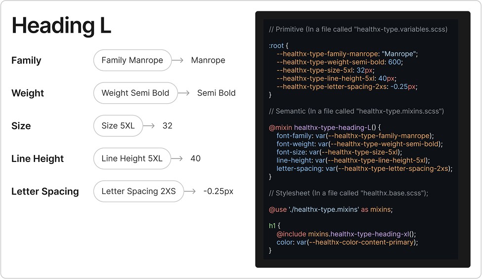
In the variables panel, you’ll find these two collections.
Primitive: Type
Semantic: Type(Web and App)


3. Spacing
Spacing is the space between text, images, buttons, and other interface elements that ensures visual harmony, readability, and usability across the experiences you create.
3.1 Scale
Global scale and t-shirt sizing
We use a global 8 point system, where a baseline of 8px is multiplied to give us a set of consistent and expected values.
In the table below, you can see all of the values we’ll be using, along with their t-shirt sized names, multipliers and pixel values.

Examples
Below examples show how spacing can be used at a component, content and screen level.
3.2 Component
In this input component, the label and help text are both 8px away from the field, and inside the field we use 16px horizontal and 12px vertical padding to frame the text and error icon, which are separated by 8px.

3.3 Content
For cards, the content is given breathing room with 16px padding on all sides, 8px between the heading and text, and 16px between the text and the authors details.

3.4 Screen
For app screens, side margins of 24px keep the content away from the edge of the screen, and inside the content area we separate each content block by 32px, then use 16px and 8px between headings and text.
If you hide the spacing, you can see how providing enough white space around each element has created a layout that makes the content easier to consume.

4. Layout and Breakpoints
Layout, or what is a set of vertical columns that allow designers and engineers to define the layout of their screens in a structured way.
4.1 Columns
HealthX uses a responsive 12 column grid for Desktop and Tablet, that becomes 4 columns on mobile or apps.
Each column contains 8px padding on either side, and the 8px side margins provide a consistent 16px gutter size across the entire grid.

4.2 Breakpoints
Breakpoints are specific points at which the layout of an interface adapts or "breaks" to accommodate different screen sizes or device orientations.
We have 4 breakpoints that cover Desktop, Tablet and Mobile devices. The mobile breakpoint can also be used for app design, as it’s the same size as an iPhone 14 or 15 pro.

5. Border
Borders outline the edges of UI elements like buttons, cards and images and vary in roundness (radius), thickness (width) and style (solid, dashed).
5.1 Border radius
Border radius is the roundness applied to the corners of a UI element. It’s used to soften it’s appearance and create a more friendly and approachable user experience.
In this example you can see how adding border radius made the design on the left, which looks corporate like Microsoft, look more consumer friendly like Apple on the right.

5.2 Border radius naming
The t-shirt sized Border Radius variables handle the roundness of corners, pill makes the left and right sides of rectangles round and circle... well turns squares into circles.

5.3 Border width
Border width refers to the thickness of borders and determines how thin or thick the lines appear. Adjusting the width can add visual prominence and emphasis to the element and communicate to the consumer that an interaction state has changed.

5.4 Border width naming
Border Width variables are named like the rest of the family, with widths from 1px to 8px. The 1.5px width is used for icons and will render fine on higher resolution screens.

6. Iconography
Icons are small visual cues that help users navigate interfaces, perform actions, and understand functionality without relying on text. They’re used in buttons, toolbars, menus, and other interactive elements to create a more user-friendly experience.
6.1 Icon sizing
A general rule for icons is that they should be used at the size they were crafted and not resized. e.g., a 24px icon should be used at 24px, not resized to 32px. This is why you see icon sets that provide 16px, 24px, 32px sizes and larger icons called pictograms that can get to up to 64px or 96px.
Each icon increases in stroke weight as it gets larger, and we use trim areas inside each icon to make sure the edges of the icon don’t touch the sides if its container.

7. Icons
HealthX is one of premium app, so we have created custom icons in various sizes such as 16, 24 and 32px.
They will act as a base set of icons for everything we create in HealthX, and we’ll create more of them and also pictograms and illustrations if we need them in future episodes.
7.1 Default (24px)

7.2 Status (24px)

8. Components
Components are reusable building blocks in a design system, like buttons, cards, or input fields, that help keep the UI consistent across a product.
8.1 Atomic Structure
Started from basic atoms (button, input) to molecules (search bar, dropdowns).
8.2 States & Variants
Covered hover, active, disabled, and selected states for each component.
8.3 Naming
Used naming like Button/Primary/Large to support logic-based search.
8.4 Documentation
Each component included guidelines for usage, dos/don’ts, and spacing.
Here's an example of button component:

Other components overview:

TESTING & OUTCOMES
Validating Speed and Impact
Faster Design Time: Reduced time-to-design for new screens by 40% by using pre-built tokens and components.
Visual Consistency: Alignment across all modules improved drastically, even when multiple designers worked in parallel.
Scalable Architecture: System is ready for future integration into Storybook and developer pipelines, saving development hours and reducing UI debt.
Reflections and Future Opportunities
What I Learned
Building a design system isn’t just about components—it’s about solving inefficiencies at scale.
Starting with a deep UI audit was critical to ensure the system solved real problems.
Design tokens and semantic naming are powerful tools for collaboration across design and dev.
What’s Next
Integrate this Figma library into developer workflow through Storybook or equivalent tools.
Create shared team onboarding material for using the system.
Conduct regular audits to evolve components as product needs change.
Thanks for taking the time to read my case study! I’d love to hear your thoughts and feedback. Always happy to collaborate, learn, and improve.
Foundational Design System for Scalable Product Development
Timeline
4 Weeks
Team
Myself (Design System Lead) Principal Designer
Responsibilities
UX & Visual Audit, Defining Design Tokens, Design System Structure and UI Kit
Tools
Figma
CONTEXT
Rushed MVP Delivery Led to Visual Inconsistencies and Inefficiencies
Design inconsistencies and fragmented components were slowing down the product development lifecycle at HealthX. Designers were recreating similar UI elements from scratch, leading to visual inconsistency, longer timelines, and reduced efficiency. As the platform grew across multiple modules in the healthcare ecosystem, the need for a scalable and unified design system became essential.
Impact: Faster design cycles, visual consistency, and design-to-dev scalability
PROBLEM
Inconsistent UI and Inefficient Workflow Were Blocking Scale
Lack of standardized components led to repeated effort and confusion.
No shared visual language caused inconsistency across modules.
Increased design time due to absence of reusable tokens or libraries.
SOLUTION
A Centralized, Scalable Design System to Align Design and Development
Defined core design foundations to bring harmony in visual language.
Built reusable components with clarity and reuse.
Designed system keeping future integration with Storybook and dev handoff in mind.
PROCESS OVERVIEW
How I Designed a Scalable System from the Ground Up
Audit First: Analyzed existing UI patterns across modules to identify inconsistencies and pain points.
Modular Approach: Structured the system to allow reuse across different products use cases.
Documentation: Created detailed documentation to help designers onboard faster and stay aligned.
RESEARCH
What I Learned from the Existing UI Chaos
Auditing the MVP screens revealed inconsistent color usages, multiple typography styles, and varied spacing schemes. We benchmarked against industry standard design systems (material design and HIG) to align with platform standards and improve visual consistency.
Pain Points
Visual Inconsistency: Multiple styles used for the same components across screens.
Naming Confusion: Designers had different naming conventions causing friction in collaboration.
Efficiency Gaps: Time wasted in recreating ui components such as buttons, inputs, and layout patterns from scratch.
Needs
A standardized token-based system for color, spacing, and type.
Clear naming and organization for quick access and use.
Scalable structure to support upcoming modules and future dev integration.
DESIGN SYSTEM FOUNDATION
Setting the Ground Rules for Visual and Functional Consistency
1. Colors
1.1 Primitive colours
Primitive colors are base-line hues like “Blue, Red and Green” that act as the default color palette for your design system.
HealthX has a 8:
1.2 Color scale
We create a 9 step tint and shade scale for the base colors. Tints are created by increasing the lightness value of the base color, and shades are created by decreasing it.
1.3 Naming
We name our primitive colors using this naming convention:
Color (group) /Value
Which for example gives us:
Brand/100
Blue/200
Teal/300
Red/400
Yellow/500
Orange/600
Green/700
Primary/White
Primary/Black
Created primitive colour variables tokens in Figma which include all the defined tint and shaded, which is in future we will use for semantic tokens
1.4 Semantic colors
Semantic colors have meaning and are named based on how they’re used, not what they look like.
A good way to visualise this is to look at the example below. The hex value has been assigned to the primitive color, which has been assigned to the semantic color, which has been used as the background of the button component.
For Dark Mode, you simply change the primitive variable that is assigned to “Background Brand” from Brand 500 to Brand 400, and if your set of brand primitive variables changes color, it will do so across the entire design system and the products that consume it.
1.5 Semantic colors naming
We use the schema in the table below to name our semantic variables.
Which gives us:
Content/Link/Hover
Background/Primary/Pressed
Border/Subtle
Surface/L3
Overlay/Inverse/50
2 Typography
2.1 Font family
To set up our typography, we start with the font family, which is a group of type faces you use across your system. HealthX uses Manrope as its default type face.
2.2 Weight
Each font family comes in different weights, which is how thick each character is. We use Regular, Medium, Semibold and Bold in HealthX.
2.3 Groups
We use five groups which covers most of use cases.
2.4 Scale
We use combination of a global 4 point scale and T-Shirt sizing to create an our type scale.
In this example, you can see the style name, followed by it’s size and line-height.
2.5 T-shirt sizing?
Instead of naming our text styles what their role would be like h1, h2 and Body we use t-shirt sizing to make them more scalable. And yes, it’s what you would expect, from 2XS to 5XL.
In this example, an h1 in one product can be Heading XL, and in another product it can be Heading L. Calling it h1 means that all of your products have to use that style and size, or you would have to create multiple typography sets to provide what each product needs.
2.6 Naming
We name our typography styles using this naming convention:
Which for example gives us:
Heading/L/Semibold
Text/L/Regular
Text/L/Semibold
2.7 Type variables
Type variables drive every value of a text style like it’s font family, weight, size, line-height and letter spacing.
In a similar way to our color variables, they’re created as Primitives then assigned to Semantic Type Variables.
In this example, you can see how they come together to provide Heading L’s values in Figma and what they look like in code as primitive and semantic css variables.
In this example, you can see how they come together to provide Heading L’s values in Figma and what they look like in code as primitive and semantic css variables.
In the variables panel, you’ll find these two collections.
Primitive: Type
Semantic: Type(Web and App)
3. Spacing
Spacing is the space between text, images, buttons, and other interface elements that ensures visual harmony, readability, and usability across the experiences you create.
3.1 Scale
Global scale and t-shirt sizing
We use a global 8 point system, where a baseline of 8px is multiplied to give us a set of consistent and expected values.
In the table below, you can see all of the values we’ll be using, along with their t-shirt sized names, multipliers and pixel values.
Examples
Below examples show how spacing can be used at a component, content and screen level.
3.2 Component
In this input component, the label and help text are both 8px away from the field, and inside the field we use 16px horizontal and 12px vertical padding to frame the text and error icon, which are separated by 8px.
3.3 Content
For cards, the content is given breathing room with 16px padding on all sides, 8px between the heading and text, and 16px between the text and the authors details.
3.4 Screen
For app screens, side margins of 24px keep the content away from the edge of the screen, and inside the content area we separate each content block by 32px, then use 16px and 8px between headings and text.
If you hide the spacing, you can see how providing enough white space around each element has created a layout that makes the content easier to consume.
4. Layout and Breakpoints
Layout, or what is a set of vertical columns that allow designers and engineers to define the layout of their screens in a structured way.
4.1 Columns
HealthX uses a responsive 12 column grid for Desktop and Tablet, that becomes 4 columns on mobile or apps.
Each column contains 8px padding on either side, and the 8px side margins provide a consistent 16px gutter size across the entire grid.
4.2 Breakpoints
Breakpoints are specific points at which the layout of an interface adapts or "breaks" to accommodate different screen sizes or device orientations.
We have 4 breakpoints that cover Desktop, Tablet and Mobile devices. The mobile breakpoint can also be used for app design, as it’s the same size as an iPhone 14 or 15 pro.
5. Border
Borders outline the edges of UI elements like buttons, cards and images and vary in roundness (radius), thickness (width) and style (solid, dashed).
5.1 Border radius
Border radius is the roundness applied to the corners of a UI element. It’s used to soften it’s appearance and create a more friendly and approachable user experience.
In this example you can see how adding border radius made the design on the left, which looks corporate like Microsoft, look more consumer friendly like Apple on the right.
5.2 Border radius naming
The t-shirt sized Border Radius variables handle the roundness of corners, pill makes the left and right sides of rectangles round and circle... well turns squares into circles.
5.3 Border width
Border width refers to the thickness of borders and determines how thin or thick the lines appear. Adjusting the width can add visual prominence and emphasis to the element and communicate to the consumer that an interaction state has changed.
5.4 Border width naming
Border Width variables are named like the rest of the family, with widths from 1px to 8px. The 1.5px width is used for icons and will render fine on higher resolution screens.
6. Iconography
Icons are small visual cues that help users navigate interfaces, perform actions, and understand functionality without relying on text. They’re used in buttons, toolbars, menus, and other interactive elements to create a more user-friendly experience.
6.1 Icon sizing
A general rule for icons is that they should be used at the size they were crafted and not resized. e.g., a 24px icon should be used at 24px, not resized to 32px. This is why you see icon sets that provide 16px, 24px, 32px sizes and larger icons called pictograms that can get to up to 64px or 96px.
Each icon increases in stroke weight as it gets larger, and we use trim areas inside each icon to make sure the edges of the icon don’t touch the sides if its container.
7. Icons
HealthX is one of premium app, so we have created custom icons in various sizes such as 16, 24 and 32px.
They will act as a base set of icons for everything we create in HealthX, and we’ll create more of them and also pictograms and illustrations if we need them in future episodes.
7.1 Default (24px)
7.2 Status (24px)
8. Components
Components are reusable building blocks in a design system, like buttons, cards, or input fields, that help keep the UI consistent across a product.
8.1 Atomic Structure
Started from basic atoms (button, input) to molecules (search bar, dropdowns).
8.2 States & Variants
Covered hover, active, disabled, and selected states for each component.
8.3 Naming
Used naming like Button/Primary/Large to support logic-based search.
8.4 Documentation
Each component included guidelines for usage, dos/don’ts, and spacing.
Here's an example of button component:
Other components overview:
TESTING & OUTCOMES
Validating Speed and Impact
Faster Design Time: Reduced time-to-design for new screens by 40% by using pre-built tokens and components.
Visual Consistency: Alignment across all modules improved drastically, even when multiple designers worked in parallel.
Scalable Architecture: System is ready for future integration into Storybook and developer pipelines, saving development hours and reducing UI debt.
Reflections and Future Opportunities
What I Learned
Building a design system isn’t just about components—it’s about solving inefficiencies at scale.
Starting with a deep UI audit was critical to ensure the system solved real problems.
Design tokens and semantic naming are powerful tools for collaboration across design and dev.
What’s Next
Integrate this Figma library into developer workflow through Storybook or equivalent tools.
Create shared team onboarding material for using the system.
Conduct regular audits to evolve components as product needs change.
Thanks for taking the time to read my case study! I’d love to hear your thoughts and feedback. Always happy to collaborate, learn, and improve.